This is the biggest upgrade since we launched our Feedsy Testimonial Walls back in the early COVID days.
With this announcement, Feedsy now delivers new ways to make you look good in front of your clients as we’ve been beavering hard on developing more design options for your Feedsy Channels.
Why?
Because you’ve been asking for it and we’ve been listening.
With our new design options you can1:
- Better match your website’s BUTTON styling
- Match the BACKGROUND colours of your Feedsy channels with your website
- Change the VIEW MORE button text to anything you like on your FeedsyWeb
- Choose from three new TEMPLATE DESIGNS of how stories are displayed on your FeedsyWeb
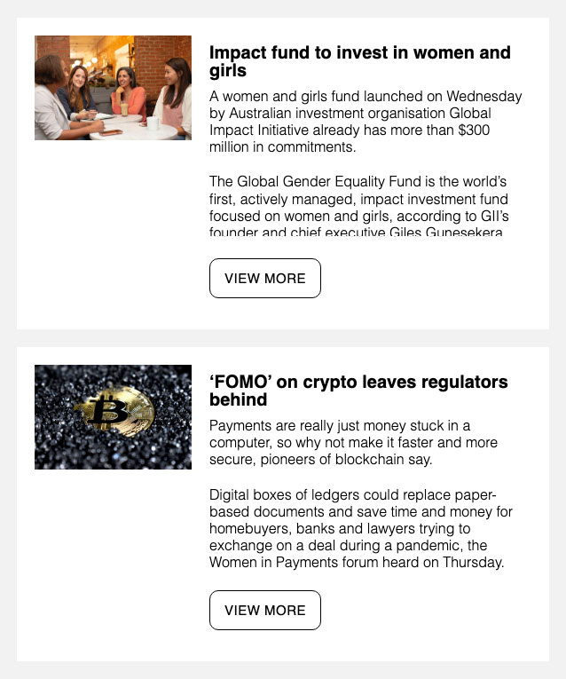
Design 1 – ClassicPLUS
By popular demand, ClassicPLUS adds a couple of sentences to our original design to give people a bit of a taste before they click to read more.
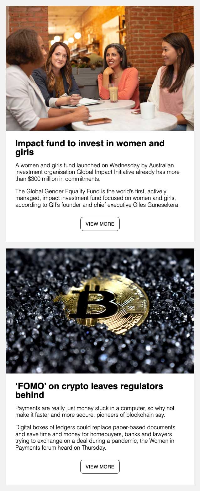
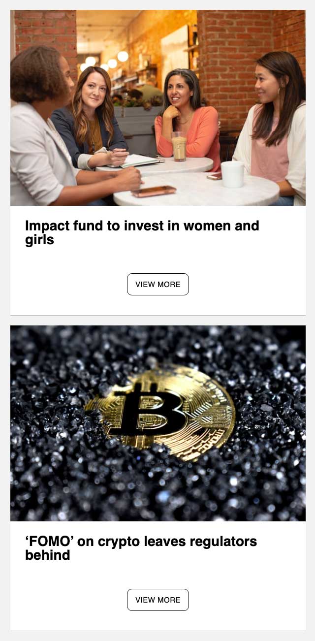
Design 2 – Small
Some wanted smaller images for a more compact design. If this sounds like you, then Small may be what you are looking for.
Like ClassicPLUS, we have teased the viewer with a couple of sentences to in our Small design.
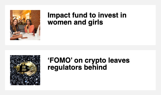
Design 3 – Square
If Small isn’t small enough for you, why not try our ultra-minimal Square style to give your newsletter an App-like feel (especially on mobile devices)?
Design 4 – Classic
OK, this isn’t new. We have kept our original because, for some, you just can’t beat a Classic.
Let us know if you’d like us to UPDATE YOUR FEEDSY STYLE1
What do you think? We’d love your input.
Who says “Looks are not everything”?
1 Only available on Feedsy Campaigner or Advocator plans